
Overview
Save Muskoka Turtles is a local conservation effort organizing to protect a local turtle nesting site. An upcoming road project plans to pave over 1,000 feet of riverbank, which is home to three types of Ontario Turtles.
The group wished to notify the public of their cause but was not confident with social media and technology. Ahead of an upcoming town hall meeting, I volunteered to design and launch a website so that members of the community could learn more about this local conservation effort and how to take action.
Role
-
Sole Web Designer & Builder
Setting
-
Non-profit group
Duration
-
Two weeks
Goals
-
Inform the public of a local construction project that will have negative environmental impacts
-
Encourage visitors to take action via donation, signing a petition or sharing on social media
Michael A.
"Olivia has done an outstanding job with the creation, design and implementation of our website. Your attention to detail and professionalism under a tight client imposed deadline is very appreciated."
Bob D.
"Thank you Olivia for designing our website. Well organized and a speedy response in preparation. It's colourful and full of information making it easy to respond to for our supporters."
Abbie B.
"Olivia made the process of designing our website under a tight deadline easy and streamlined. Her attention to detail and creativity helped make our website stand out. She is wonderful to work with and I would not hesitate to recommend her services."
Research
Interviews
A short interview was conducted with the clients to learn about the main objectives of the campaign. We discussed the concerns of the project and brainstormed the type of content to be presented.
Key Takeaways
Mobile friendly
As the website would be presented during a town hall meeting, it is likely that many first-time visitors would be on mobile.
Calls to action
The group identified the need for donations, pressure on local politicians, and amplification of the issues. They not only want to inform the public, but to have the community come together to reach their goal.
Content
Leaning on the deep knowledge base of the group, I was provided with written content to feature on the site. This would allow me to focus my limited time on shaping the content into digestible chunks so users could understand the issues without being overwhelmed.
Imagery
Emotive photography is essential to garner sympathy for charitable causes. The group had some images but they were not high definition. I would have to source better images elsewhere.
Competitive Analysis
To kickstart my design process, I did a quick investigation scan of other conservation websites to see which elements I wanted to incorporate into my own designs.
Elements to use
-
Full-width hero banner. Great place for a compelling image and one-liner about the project.
-
Movement. Animations made me more compelled to continue exploring.
-
Varied content. Breaking up the page with images, headers and quotes.

Elements to avoid
-
Single page sites. This feels overwhelming when the content is text-heavy.
-
Detailed information on the homepage. Distracts from the calls to action and dissuades from exploring other pages.
-
White & black colour schemes. Felt too sterile for a wildlife topic.

Information Architecture
Main Considerations
The group provided me with a document of all the written content to include on the website. Before working on the design, I wanted to have a clear idea of which content would be displayed on each page, and how many pages the site should have.
-
Keep the homepage light. The suggested content for the homepage was very dense and gave more information than necessary. I decided that the homepage should only include a high-level description of the project, and include a “Learn more” button to redirect interested visitors to view the rest on a separate “project description” page.
-
Break up into engaging pieces. The project description is quite detailed and includes lots of important information, though I worried large blocks of text would be intimidating to visitors. To keep them engaged, I broke up the text with images and headings to make it less overwhelming.

Use as overview message on homepage
Move to detailed "What's Happening" page as background story.
Use as descriptors under the call-to-action buttons.
Sitemap

Design
At first, I planned to do sketches on paper, but instead, I went straight to a website builder. I started with a basic template that was close to what I had envisioned and started to fill in the content. Since I already had the copy, I wanted to see how the text filled the space and work my design around it.
Two Column Layout
This layout allowed for easy reading of text as the eye had less space to travel across. The mobile version simply stacks columns.
This also allowed images placed adjacent to the text blocks, avoiding full-width images. Some of the photos I was provided looked grainy when enlarged.


Color Scheme
I went with a deep green and yellow colour scheme as a nod to the endangered Blanding’s Turtle the group was trying to protect.


Endangered Blanding's Turtle
Calls to Action
Since the calls to action were very important, I made sure to include them on every page of the site.
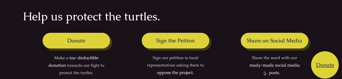
I used a deep purple background to make the section stand out and added animated elements to draw attention.
I also included a hovering donation button on each site page, so that it was always accessible to visitors on desktop.
Iteration
Before

After

My first idea for the “Meet the Turtles” section was to use rectangular cards for each turtle species. However, I found this design didn’t allow enough space for all the desired content.
Instead, I used the same structure I had used on the homepage but replaced the header box with the turtles’ image. I liked the consistency it gave, and looked less cluttered.
Testing
Due to time constraints, I was not able to conduct full usability testing with the initial design. Instead, I held a workshop with the group members to collect their feedback, walking them through the site. Their feedback was mainly positive, with a few notes on changing the wording of header text.
Because I showed them the site in a group setting, I believe that some members may not have felt comfortable giving constructive criticism. In the future, I might, in addition, email out the designs so the clients can explore it at their leisure and give written feedback.
Final Designs


Conclusion
The group was very happy to have their message consolidated in one place. Now they are able to direct people to the website to learn more and take action, instead of relying on word of mouth.
Results
Site Visits:
250+
Petition Signatures:
788
Average Session Duration:
5m 50s
Donations:
$1,485
Next Steps
The group expressed an interest in expanding the website to be a hub for other turtle conservation initiatives in the area. I suggested adding an email forum to the site to facilitate collaboration with other interested groups and individuals.